Website Research - Jessie J

Front Page


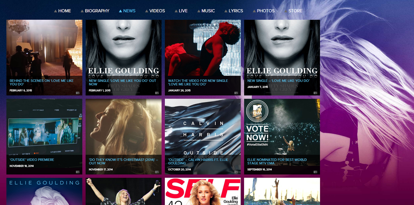
On Jessie J's official website, they have put all the navigation buttons at the top so it will be spotted very easily and a reason to have these navigation is that it will allow consumers to go to the relevant page without going through the whole website to find it - creating an ease to use the website. They have also used a similar colour scheme to the whole website with light golden brown solid colour as background and black text on top so it fits with the style of the website throughout as it will appear on every single page to produce a sense of flow. The use of dark and dull colours also further emphasise her star image of being a strong, confident artist.

Every time you enter the website, her latest music video will come up as a pop up so the consumer knows what her latest song is instantly and this will also increase the views on her videos since this created an extra platform to allow people to notice her videos. It may also allow her to increase her sales because when they like the song they might consider purchasing it on iTunes or the album. However, this can get annoying because it keeps popping up on every single page.

On the top left, there are buttons for you to press that allows you to sign in and comment on the websites like on her latest new articles. They also put in a button to allow users to send an email to the company that manage Jessie J so her fans can her things they would like to know. This creates a sense of closeness between the artist and audience which helps to keep her star image to be positive. 


Other Pages

Instead of clicking the navigation buttons, you can also scroll down and it will also take you to these pages and I think that this is good because it allows new fans to recognise her as a whole by just scrolling down her page. 

One of her pages is about her latest news so fans can find out what she has been doing lately. 

Having her tour dates on the website allow users to find out exactly where and when she will be performing. Displaying tickets button right next to the date will allow you to purchase tickets very easily which can help increase her sales as users won't have a problem finding the right tickets for the right show or even just going to through the effort of searching for it on Ticketmaster.

She has a biography so new fans can get to know her and again this further builds on the concept of making it as close and friendly between the artist and audience as possible. 

Then she has a tab on her music which is the main focus of the website. On this page you can find out about her latest songs, most popular albums and they have even placed a playlist for the audience to listen to her songs through Spotify - cross-media marketing. They have also placed quick links to iTunes, Amazon and Google Play so consumers can purchase the song if they want to. Again this is done through the idea of creating easy access to hope for more sales.

They then have a page on her photos and videos so consumers can see a different side of her like behind the scenes footage/photos, her life on the social media. This is will create more curiosity for the fans because when you have managed to find something different from just music videos and photoshoots, you are more likely to be searching about her and read everything related about her and possibly increase the positivity towards her.

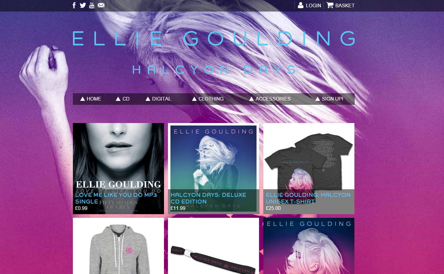
She also has an online shop which sales her merchandises. This will increase the profit out of her songs. Having a shop link on the website is good because the users know these items are official unlike the ones on Amazon or eBay. They may also be limited edition so the fans are more willing to pay more for it. 

Lastly, at the bottom of the website there are links to more social media so fans can start following her and read all about her. They have also put in a logo of the company for copyright reasons and to let people know which company she is working for.

  • Digg
  • Del.icio.us
  • StumbleUpon
  • Reddit
  • RSS

Website Research - Ellie Goulding


As soon as you enter Ellie Goulding's official website, her video shows up in full screen which allows consumers to know more about her music like Jessie J's pop up music video. To make it even more effective they have placed a button to hide the captions/titles right at the top, which allow you to go straight to the website, so new users will most likely have to finish watching the whole video before they could find a way to skip to the actual website. It could get annoying but this is also a marketing strategy as this will increase the chance of people watching the whole video.


On her website, she also have the must-use pages such as home, biography, news, videos, tour dates/live, music, photos and store with relevant information on each page. However, there's also a page for her lyrics so people can visit her website for the lyrics which can guarantee accuracy. 

The colour scheme for her website is based on the blues, pinks and purples which create an interesting feel because it is not as solid as the other websites. These colours also bring out her character very well as her brand image is creative and different with her unique birdlike high toned voice. 


On the photos page she also included cover art so users know exactly what her album looks like so they could find it in store with ease. This also show all the songs she have on one page so consumers can find that out just by looking at the photos.


  • Digg
  • Del.icio.us
  • StumbleUpon
  • Reddit
  • RSS

Websites in General

While I was research through music artist's websites, I have found that one of the typical codes and conventions is to have a large scale photo of the artist on their front page - especially Pop genre artists. They also have navigation buttons such as home, news, bio, music, tour dates, shop so we can look at all the things related to the artist with ease. It is also very popular to have social networking sites linked on every single pages on the website so fans can instantly access their Facebook, Twitter, Instagram and others. 

Each genre also has its own style for their websites. For example, indie artist usually incorporates a darker or a funky coloured background for their websites - it is also less likely to have an image of an indie male artist on the front page. However, pop genre likes to stick with white background and calm but bright colours. Another thing is that they ALWAYS have an image of the artist as their front page and those images is most likely to be everywhere around the website since pop artists use their face as a branding technique more than other genre's artists.

  • Digg
  • Del.icio.us
  • StumbleUpon
  • Reddit
  • RSS

Digipak - Final Design

Here is my final design for my digipak.


  • Digg
  • Del.icio.us
  • StumbleUpon
  • Reddit
  • RSS

Digipak - Production Logo

I have realised every album or digipak contains the studio logo that the artist is under near the bottom of the back cover. I have also looked into creating my own production logo with our production name 'JLJ Productions'. I have used Universal Records' logo as an inspiration and created something similar. 


This is what I came up with and I had to create 2 versions with slightly different colouring to see which one goes well with my back cover. 


  • Digg
  • Del.icio.us
  • StumbleUpon
  • Reddit
  • RSS

Digipak - Improved CD Design

To improve my design for the CD I have drawn some doodle illustration (similar to music video's graphics) onto paper and then scanned it on to the computer to incorporate into my design. 


I created 2 designs with the illustration.

This is my favourite because it looks less confusing and it fits the genre more.

  • Digg
  • Del.icio.us
  • StumbleUpon
  • Reddit
  • RSS

Digipak - CD Design

As I was thinking how I could create the CD design, I thought of using balloons (which is one of the codes and conventions of the artist) as the background and the CD cover just like how Katy Perry used candy and doughnut as hers for Teenage Dream. 


However, I thought the CD did not stand out therefore I made it white and written the title and artists' name on it instead. I might also improve the design by adding illustration drawings around the CD to make it more interesting.


  • Digg
  • Del.icio.us
  • StumbleUpon
  • Reddit
  • RSS