Here is my final design for my digipak.
Showing posts with label album art. Show all posts
Digipak - Improved CD Design
To improve my design for the CD I have drawn some doodle illustration (similar to music video's graphics) onto paper and then scanned it on to the computer to incorporate into my design.
I created 2 designs with the illustration.
This is my favourite because it looks less confusing and it fits the genre more.
Digipak - CD Design
As I was thinking how I could create the CD design, I thought of using balloons (which is one of the codes and conventions of the artist) as the background and the CD cover just like how Katy Perry used candy and doughnut as hers for Teenage Dream.
However, I thought the CD did not stand out therefore I made it white and written the title and artists' name on it instead. I might also improve the design by adding illustration drawings around the CD to make it more interesting.
Digipak - Lyrics Page
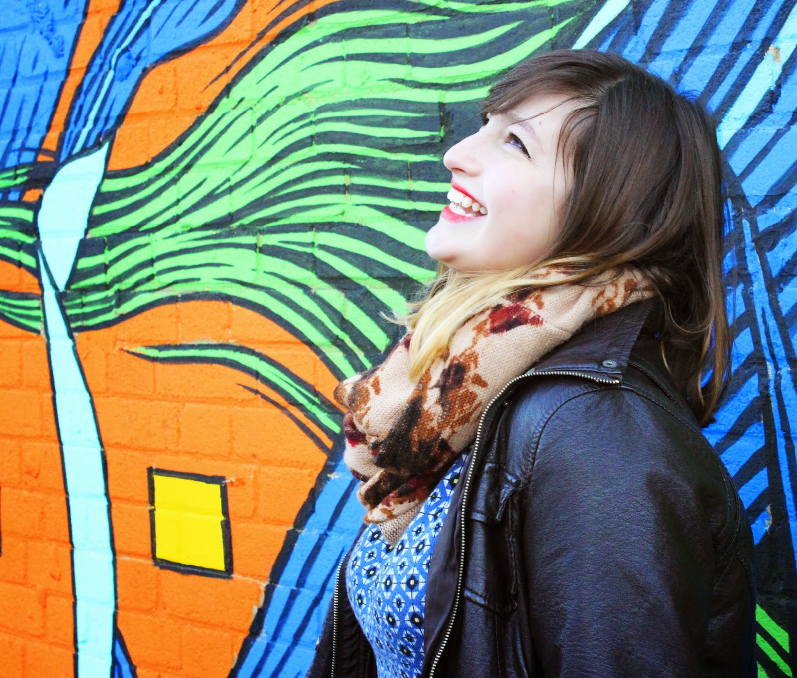
For my lyrics page in the digipak I wanted to include pictures of the artist like they do in other digipaks I looked at. I have chosen to use some of the photos that we took during our Brick Lane shooting.
One of the problems was that the lyrics for the song is quite long therefore I had to find a way to make it easily visible but still look good so I thought of splitting it into 2 pages that will be in the centre of the digipak so it will be right next to each other when opened up. I also chose photos that have the artist on one side so I could place them together and put the lyrics on the side that more empty.
Another problem I had was that the background is quite colourful and vibrant therefore the lyrics didn't show up well, even when using a different colour from the background. I had to create a box to place behind the lyrics and lower the opacity so the lyrics could be shown.
Here is my first attempt. However, I did not like the way 'Brokenhearted Lyrics' looked when joined the 2 pages together therefore I had to change something to make it work.
To improve from the previous attempt I have made 'Brokenhearted' bigger and deleted 'Lyrics' which made it appear to be much more attractive. I have also applied a glow to the title so it will show up better.
Digipak - Final Front Album Cover
This is the final version and I've chose to use a softer colour scheme for the album cover. I wanted the colours to match the colour scheme of the music video therefore I used pastel colours. Firstly, I made the background of the photo lighter and increased the contrast of her. I then pasted on some of the balloons again so the cover is not so white. Since there is a lack of yellow therefore I used a pastel yellow colour for the title with her name in black to make it stand out. I also applied the technique of duplicating some parts of the image to make it stand out that I learned from creating my second practise cover. I like this version better than the first and second one because I think it makes her seem much happier, which is what she is supposed to be like - matching the theme. I also think this cover work very well with a cut out album casing that allows either her name or her face to show through the front.
Digipak - Experiments
After researching about album covers I also tried out some of the techniques myself to see if they are good for my album cover and whether it matches the genre.
For the first one, I have lighten the background and increased the constrast to make her stand out from the background. I have chose to use 'Northwest' as the font because the other fonts makes it too messy. It also matches the theme more with the simple, clean finish. I have used yellow for 'Brokenhearted' make it even more colourful and fun. I do like this version but I feel like the photo gives too much of a strong character, which is not something that's very visible in the music video therefore I think I'll need to use a different photo.
This is the second version that I designed. I like the use of shapes that was inspired by one of the album covers that I researched. I used Illustration to create the shapes so its sharper and it is also easier to get them in the right scale with the help of guidelines that I can't get on Photoshop. I then duplicated the layer of the face so it will stand out. However one of the problems I had was there wasn't enough space for the titles and it made it look very packed together when added on. I don't think I will be using this technique for my final design because it doesn't match the insides of the digipak and it doesn't seem like a Pop genre album cover.
Digipak - Editing the Photos
Before using any of the photos for the digipak, there are some bits that I needed to edit and correct to make it look better on Photoshop. On each photo I have edited the brightness and contrast of the photo to make it brighter and more professional looking. The trick to this is to create a paler face to make it seem airbrushed naturally. This also enhance the boldness of the photos with its good quality.

The face may seem quite flawless after you turn the brightness up but there are always some blemishes or spots that will still be there to make the face appear to be a little bumpy. Here I have used the spot healing brush tool to edit out the freckles on her nose and her cheeks near her eyes. This will further allow her to appear to be perfect and flawless.
Other than the subject itself, there will be some things that could be corrected in the background or around her. In this particular photo, there are some holes in the background we used so I again used the spot healing brush tool to cover it up.
In some of the photos her lipstick may be slightly imperfect from the dryness or it has started coming off so I have selected the colour of her lips and painted it over her lips with a paint brush on a new layer. After getting it accurately painted, you will see that it appear to be too fake and artificially edited therefore I have lowered the opacity of that layer to something like 30-50% so the original texture of her lips still show through along with the colour enhancement.
Another editing point may be the dark circles under her eyes. I have used the healing brush tool to fix this by selecting a section around that area by pressing 'alt' and slowly painting over those darker areas to brighten it up. This will also allow her face to appear cleaner and less tired.
These photos could also be used for the website too and that will keep the consistency of the website and digipak.
Digipak - Typeface
I have looked at some fonts that might be suitable on dafont.com. I then typed out the name of the artist 'Matilda Childs' and tested whether the letters and the font work well together considering factors such as what it will look like on the actual front cover on top of a photo of her and on the lyrics pages etc...
The fonts that I thought might be suitable are...
Story Book
Sweet Pea
Atlantic Cruise
Aku & Kamu
Mix Brush
Northwest
The Matic
The Million Mile Man
I found that the most suitable fonts are simple, bold, San Serif fonts, especially when the image is quite busy already with lots of colours and objects. However, funky, curly fonts can be great if the cover image is quite simple and the type can make it more fascinating. This means that the font that I use will mainly depend on which photo I am choosing as my front cover and how busy that is.
Third Photoshoot with Balloons
During our shoot for the performing scenes with balloon room, we also took some photos for our digipak and website. These photos will be suitably edited for the right platform with the use other codes and conventions, i.e. a barcode for the back of an album.
Second Photoshoot in the Park
When we were filming in the park for one of our narrative scenes, we also took some photos that could be used for our website or album booklet. These photos will help explain the narrative side of our music video rather than having it fully focus on the artist. Also the change of scenery/location will make our digipak or website much more interesting. However we do have to be careful with how we use these photos because the colours are very different to the other photos so it could break the consistency of the whole digipak or website.
First Photoshoot at Brick Lane
As we started filming for our music video, we have noticed that we will need some photos that could be used for our digipak and websites later on therefore we have took some photos with the same location and background as our footage so it looks like everything is related instead of using screenshots of our footage.
The photos were taken at Brick Lane with the use of bright, colourful graffiti/ street art. I think this location is perfect because it provides 'sass' from its urban art but also reveal a sense of happiness from the artist with her smile which creates an interesting contrast.
These photos were taken at Kingston, but it is also done with the same concept by using colourful graffiti.
Subscribe to:
Posts (Atom)